Dashboard
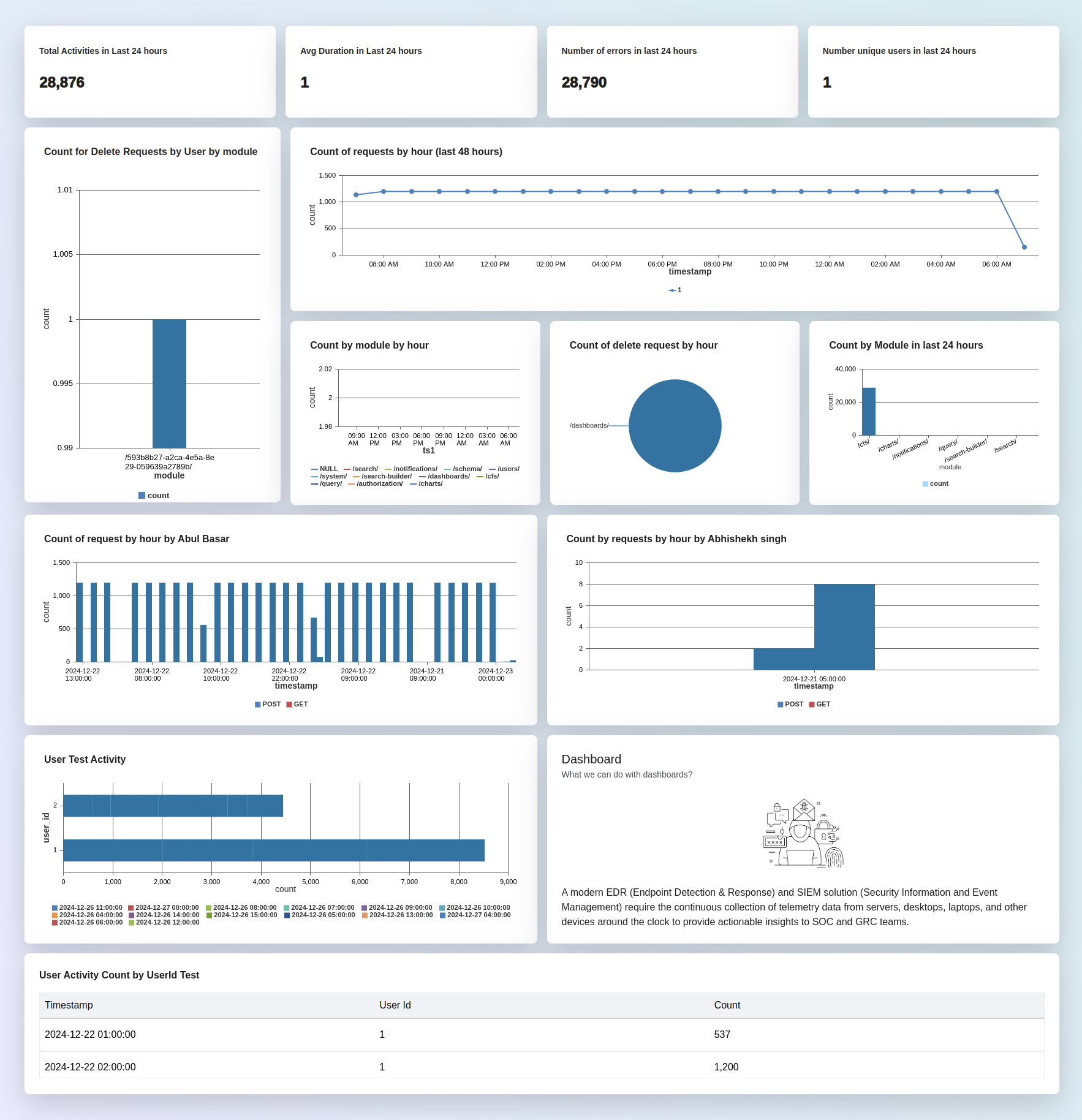
Dashboards incorporate charts, graphs to represent data in a clear and intuitive manner. This visualization helps users quickly grasp trends, patterns, and insights without needing to analyze raw data.
You can customizable a dashboard to suit the specific needs and preferences of users or organizations. Users may have the ability to select which metrics to display, adjust timeframes, apply filters, and rearrange components to create a personalized view that aligns with their objectives.
A dashboard contains multiple charts.
Chart
Charts are graphical representations of data that allow users to visually analyze and interpret information. Charts help users identify trends, patterns, and relationships in the data more effectively than examining raw numbers or text alone.
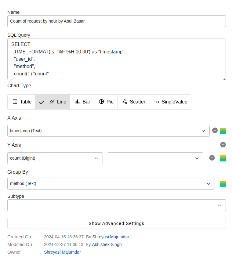
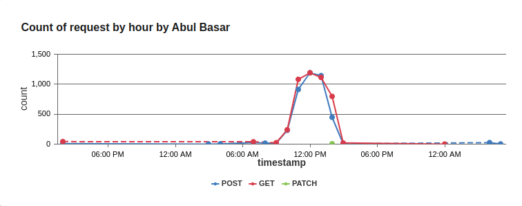
Chart Types
| Type | Description |
|---|---|
| Line Chart | Shows data points connected by straight lines, typically used to display trends over time or relationships between two variables |
| Bar Chart | Uses rectangular bars to represent the quantities of different categories or groups, often used to compare discrete categories. |
| Pie Chart | Divides a circle into sectors to represent the proportion of each category in a dataset, suitable for showing parts of a whole. |
| Scatter Plot | Represents individual data points as dots on a two-dimensional plane, used to visualize the relationship between two variables. |
| Single Value | Single value charts allow users to visualize and highlight a single data point or metric for quick analysis. |
| Table | Tabular representation of the data. For example: show top 10 customers by order amount. |
How to create a chart?
- Navigate to Chart Builder: In your Avalanchio account, go to Chart Builder.
- Create New Chart:
- Save Campaign: Click on Save to save your new chart.
- Edit Campaign Details: After creating chart, you will be able to edit the chart's details.
| Field | Description |
|---|---|
| Name | This should be a unique name by which the chart can be easily identified. |
| Data Source Type | Specify the type of data source for the chart.Available sources: Saved Query, Sql, Chart Type. |
| Chart Type | Choose the type of chart (e.g., bar, line, pie) that best represents the data. |
Data Source Types
- Saved Query: Utilize pre-defined queries saved within Avalanchio for data retrieval.
- SQL: Use SQL queries to directly fetch data from the database.
- Script: Execute custom scripts to gather and process data for the chart.
Customization user can apply to a chart
What are x-axis and y-axis values in a chart?
In a chart, the x-axis and y-axis represent the horizontal and vertical axes, respectively, and they define the scale and values displayed in the chart. Here's a breakdown of what the x-axis and y-axis values typically represent:
X-Axis:
The x-axis is the horizontal axis of the chart. It represents the independent variable or category in the data being plotted. On the x-axis, you typically find labels or values that represent different categories, time intervals, or numerical values. For example, in a line chart showing sales data over time, the x-axis might represent different time periods (e.g., months or years). In a bar chart comparing sales performance across regions, the x-axis might represent different regions or countries. Y-Axis:
The y-axis is the vertical axis of the chart. It represents the dependent variable or measured quantity in the data being plotted. On the y-axis, you typically find numerical values that correspond to the data points being plotted. For example, in a line chart showing sales data over time, the y-axis might represent the total sales revenue. In a bar chart comparing sales performance across regions, the y-axis might represent the total sales volume or revenue for each region.
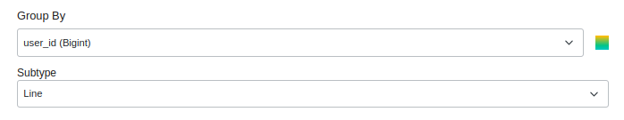
What is group by value?
In a chart, the "group by" operation is a way to organize and aggregate data based on specific criteria before plotting it on the chart. It allows you to group data points together based on one or more categorical variables, and then calculate summary statistics or aggregate values for each group.
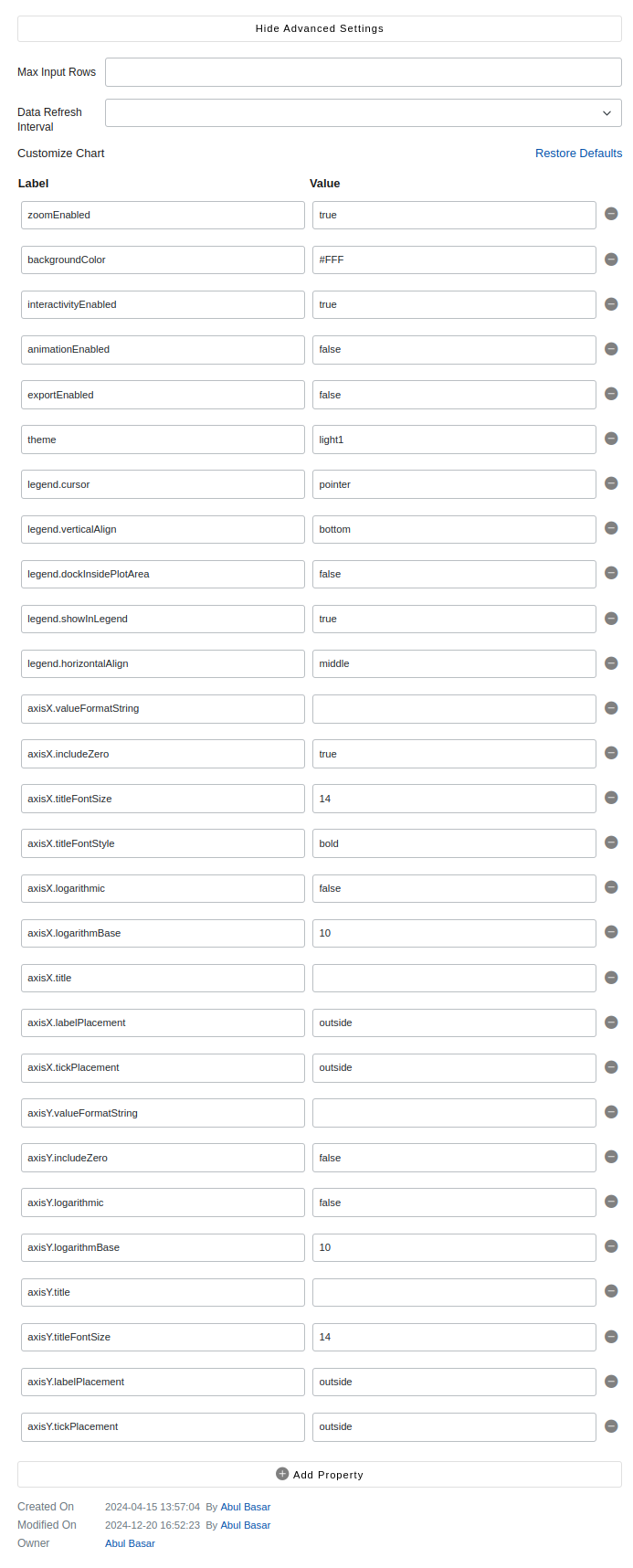
Advance Features
| # | Feature | Description |
|---|---|---|
| 1 | Max Input Rows | |
| 2 | Data Refresh Interval | |
| 3 | Customize Chart | |
| 4 | zoomEnabled | |
| 5 | backgroundColor | |
| 6 | interactivityEnabled | |
| 7 | animationEnabled | |
| 8 | exportEnabled | |
| 9 | theme | |
| 10 | legend.cursor | |
| 11 | legend.verticalAlign | |
| 12 | legend.dockInsidePlotArea | |
| 13 | legend.showInLegend | |
| 14 | legend.horizontalAlign | |
| 15 | axisX.valueFormatString | |
| 16 | axisX.includeZero | |
| 17 | axisX.titleFontSize | |
| 18 | axisX.titleFontStyle | |
| 19 | axisX.logarithmic | |
| 20 | axisX.logarithmBase | |
| 21 | axisX.title | |
| 22 | axisX.labelPlacement | |
| 23 | axisX.tickPlacement | |
| 24 | axisY.valueFormatString | |
| 25 | axisY.includeZero | |
| 26 | axisY.logarithmic | |
| 27 | axisY.logarithmBase | |
| 28 | axisY.title | |
| 29 | axisY.titleFontSize | |
| 30 | axisY.labelPlacement | |
| 31 | axisY.tickPlacement |